A customer churn prediction app for Telco customers
Telecom companies lose a meaningful share of customers every month, and it is far cheaper to keep an existing customer than to acquire a new one. The problem this project tackles is simple to state: given a customer's account details, can you flag the ones likely to leave soon, and tell the retention team something useful enough to act on?
The code is on GitHub, and the notebook has the full analysis if you want to follow along step by step.
What it does
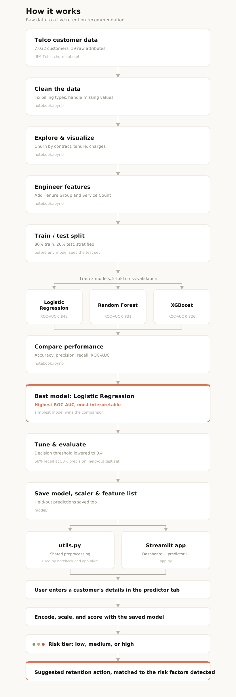
The app is built on IBM's public Telco Customer Churn dataset, 7,032 customers after cleaning. A Jupyter notebook runs the full pipeline (cleaning, feature engineering, model comparison, tuning, evaluation), and saves the trained model. A two-tab Streamlit app then serves it.
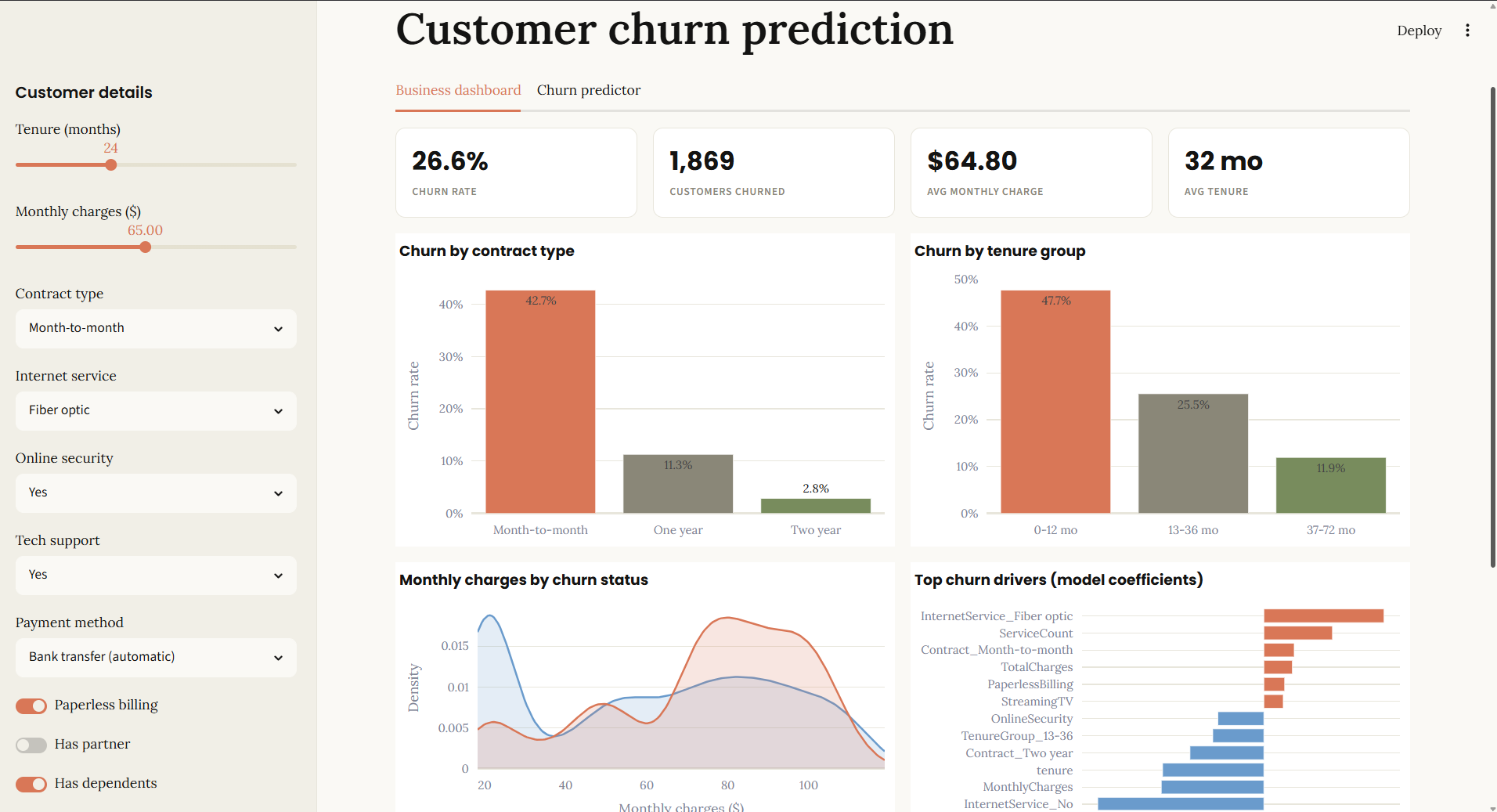
Business dashboard. Churn rate, customers churned, average charge and tenure, plus charts for churn by contract type, churn by tenure group, and the monthly charges distribution. A "key observations" box computes its numbers live from the current data instead of hardcoding them, and an expandable section shows the confusion matrix and ROC curve computed on the held-out test set.
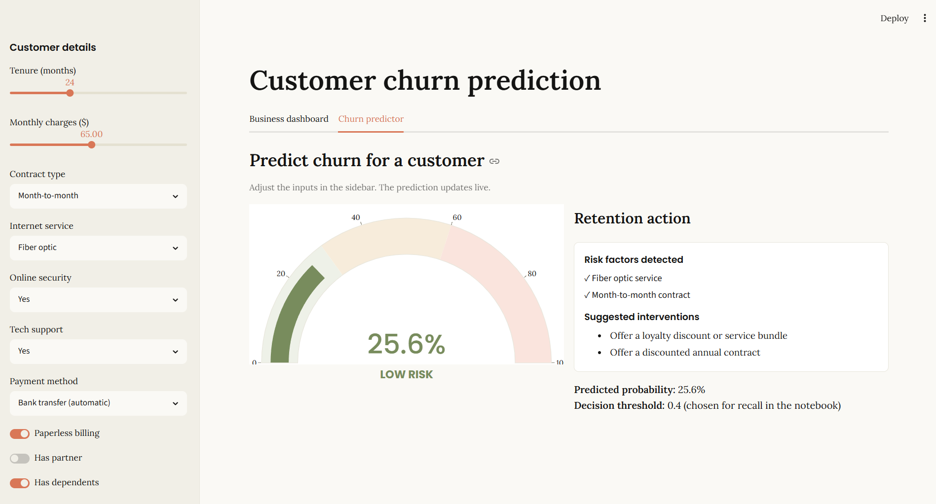
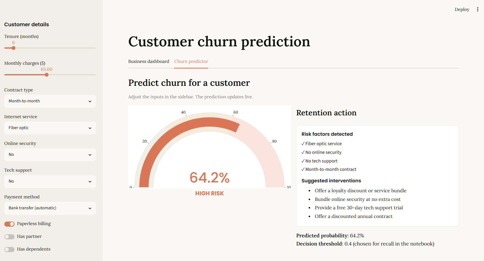
Churn predictor. Enter a customer's contract type, tenure, charges, and service details, and get a live churn probability, a risk gauge, and a checklist of exactly which risk factors this customer is carrying, each paired with a specific retention action.
How it was built
Cleaning and features. A handful of rows had blank total charges (all new customers with zero tenure), a few billing fields needed type fixes, and categorical fields were one-hot encoded. Two engineered features were added on top of the raw columns: a tenure group bucket and a count of add-on services a customer subscribes to.
Model comparison. Three models were compared with 5-fold stratified cross-validation: Logistic Regression, Random Forest, and XGBoost.
| Model | Accuracy | Precision | Recall | F1 | ROC-AUC |
|---|---|---|---|---|---|
| Logistic Regression | 0.803 | 0.659 | 0.537 | 0.592 | 0.848 |
| Random Forest | 0.797 | 0.654 | 0.503 | 0.568 | 0.831 |
| XGBoost | 0.788 | 0.621 | 0.520 | 0.566 | 0.826 |
Logistic Regression won on ROC-AUC while being the simplest and most interpretable of the three. This is a common result on this dataset: churn is driven largely by a handful of near-linear signals like contract type and tenure, so a well-regularized linear model keeps up with gradient boosting. It is also the model you can actually explain to a retention team, since every prediction traces back to a small set of readable coefficients.
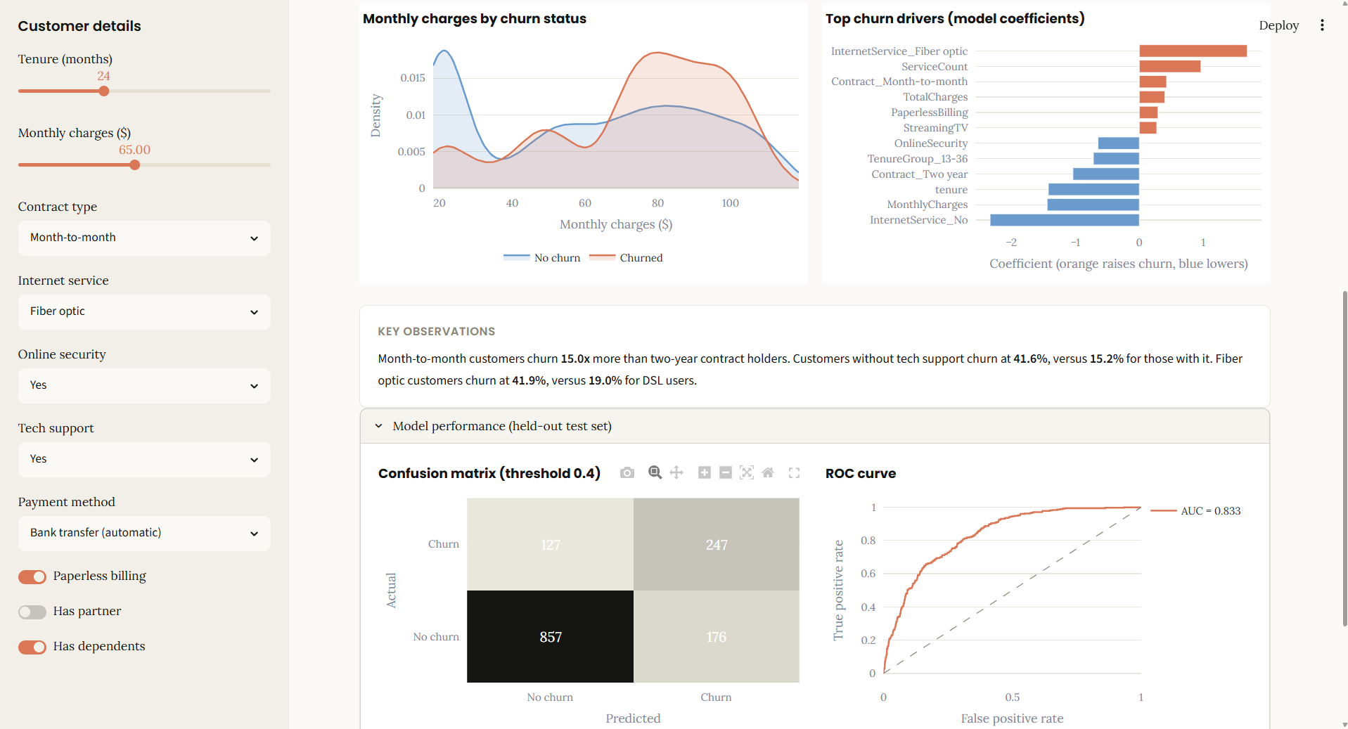
Recall over precision. Missing a customer who was about to leave costs a lot more than one unnecessary retention call, and churn is the minority class here, so the default 0.5 threshold under-predicts it. Lowering the threshold to 0.4 trades a bit of precision for meaningfully more recall. On the held-out test set, the deployed model catches 66% of real churners at 58% precision.
A feature engineering lesson. Early on, I added an "average monthly charge" feature (total charges divided by tenure) next to the existing monthly charge column, on the theory that it captured spending rate independent of how long someone had been a customer. In this dataset, nobody's bill changes over time, so dividing total charges by tenure just reconstructs the monthly charge you started with: the two columns were correlated at 1.00. Feeding the model two copies of the same signal did not change its accuracy, but it did distort the coefficients, and the "top churn drivers" chart started pointing at the wrong features. Removing the duplicate fixed the chart without changing performance at all. It is a good reminder to check for correlated features before trusting a coefficient chart, not just before trusting a prediction.
Curated retention actions, not auto-generated ones. The predictor's risk-factor checklist only pulls from a short, hand-picked list of attributes that each have both a stable coefficient and an obvious action attached: contract type, internet service, online security, tech support. Numeric features like total charges or service count are left out on purpose, even where they carry a large coefficient, because there is no sane retention action for "this customer spends a lot of money."
Key findings
Contract type is the clearest signal in the data. Month-to-month customers churn far more than annual contract holders, and most churn happens in the first 12 months. Fiber optic service and the number of add-on services a customer has are the next strongest risk factors.
Where it stands
Recall, precision, and the ROC curve are all computed on a held-out test set the model never trained on, and shown directly in the dashboard rather than left buried in the notebook. If you want the full comparison table, the tuning steps, and the reasoning behind each choice, the notebook walks through all of it.
Bhuvan Desai
Applied AI & Data Science @ IIT Jodhpur · SIH 2025 National Finalist
Second-year B.S. Applied AI & Data Science student at IIT Jodhpur, focused on AI/ML, data science, and backend development. I build real projects end to end — from fine-tuned language models and agentic AI systems to production backends. Currently looking for an AI/ML or Data Science internship in Bengaluru.