An India air-quality dashboard, and an AI assistant that reads the real data
Air pollution in India is one of those problems everyone has a statistic for but few people have a feel for. I wanted to fix that for myself: take five years of official air-quality readings, turn them into something you can actually explore, and then go one step further — let an AI assistant answer questions about it by looking up the real numbers instead of making them up.
Here is what I built, why the raw data needed fixing first, and how the AI part works.
Two links if you would rather just play with it: the live dashboard and the AI server on Hugging Face. The code is on GitHub.
What it is, in one paragraph
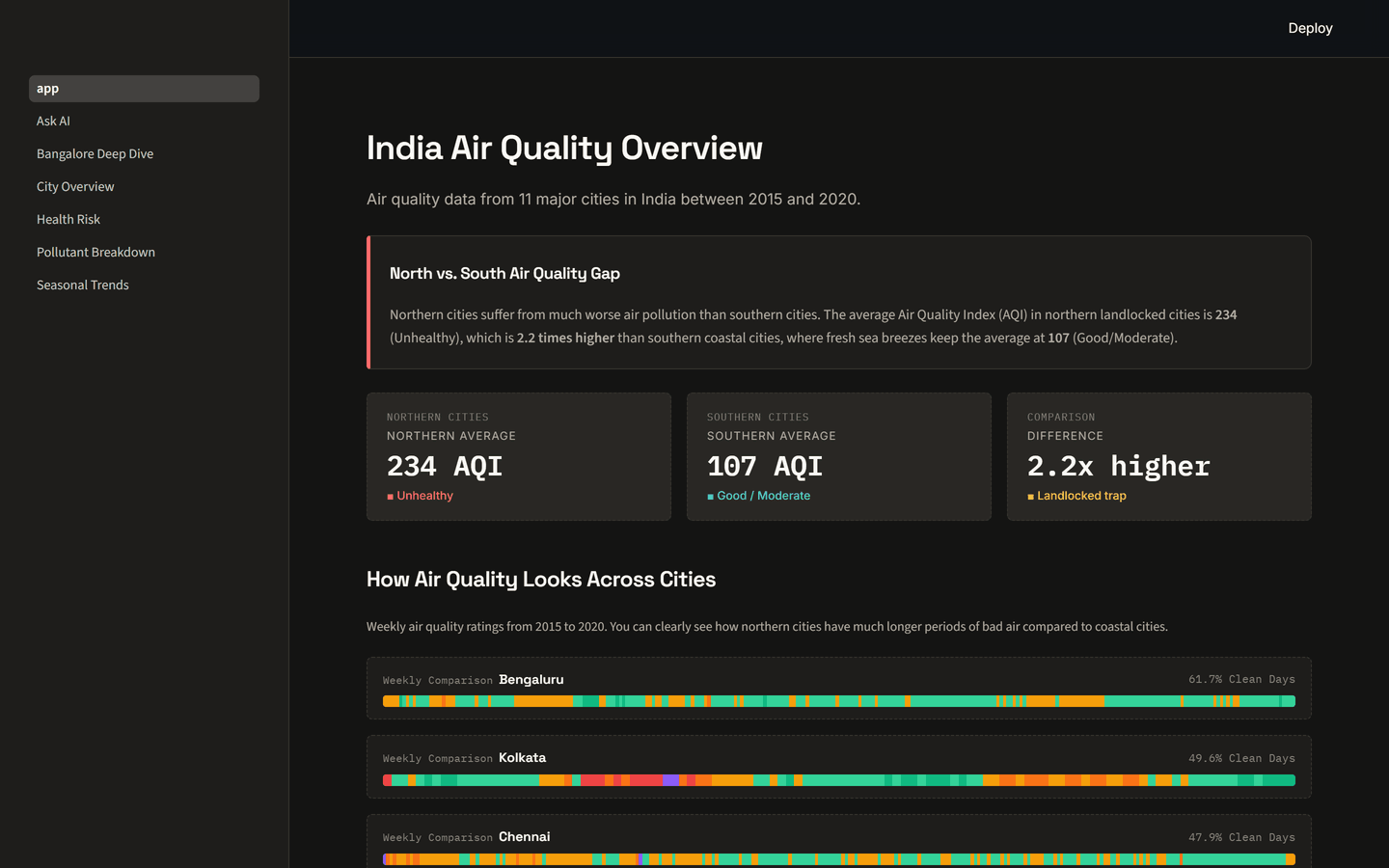
A dashboard covering 11 major Indian cities, every day from 2015 to 2020, built from official data published by India's Central Pollution Control Board (CPCB). It does not just throw charts at you — it tells a story: the gap between northern and southern cities, which pollutant is the real culprit in each place, how the seasons and the COVID lockdown changed the air, and who is most at risk. Sitting on top of all that is an "Ask AI" assistant you can talk to in plain English.
One bit of vocabulary before we start: AQI stands for Air Quality Index — a single score from 0 to 500 where higher is worse. Roughly speaking, under 100 is broadly fine, the 200s are firmly unhealthy, and 400+ is hazardous to everyone.
A quick tour
The big picture. The landing page opens with the headline the data keeps repeating: northern, landlocked cities average around 234 AQI (unhealthy), while southern coastal cities sit near 107 — more than twice as clean. Sea breezes, it turns out, do a lot of quiet work blowing pollution away.
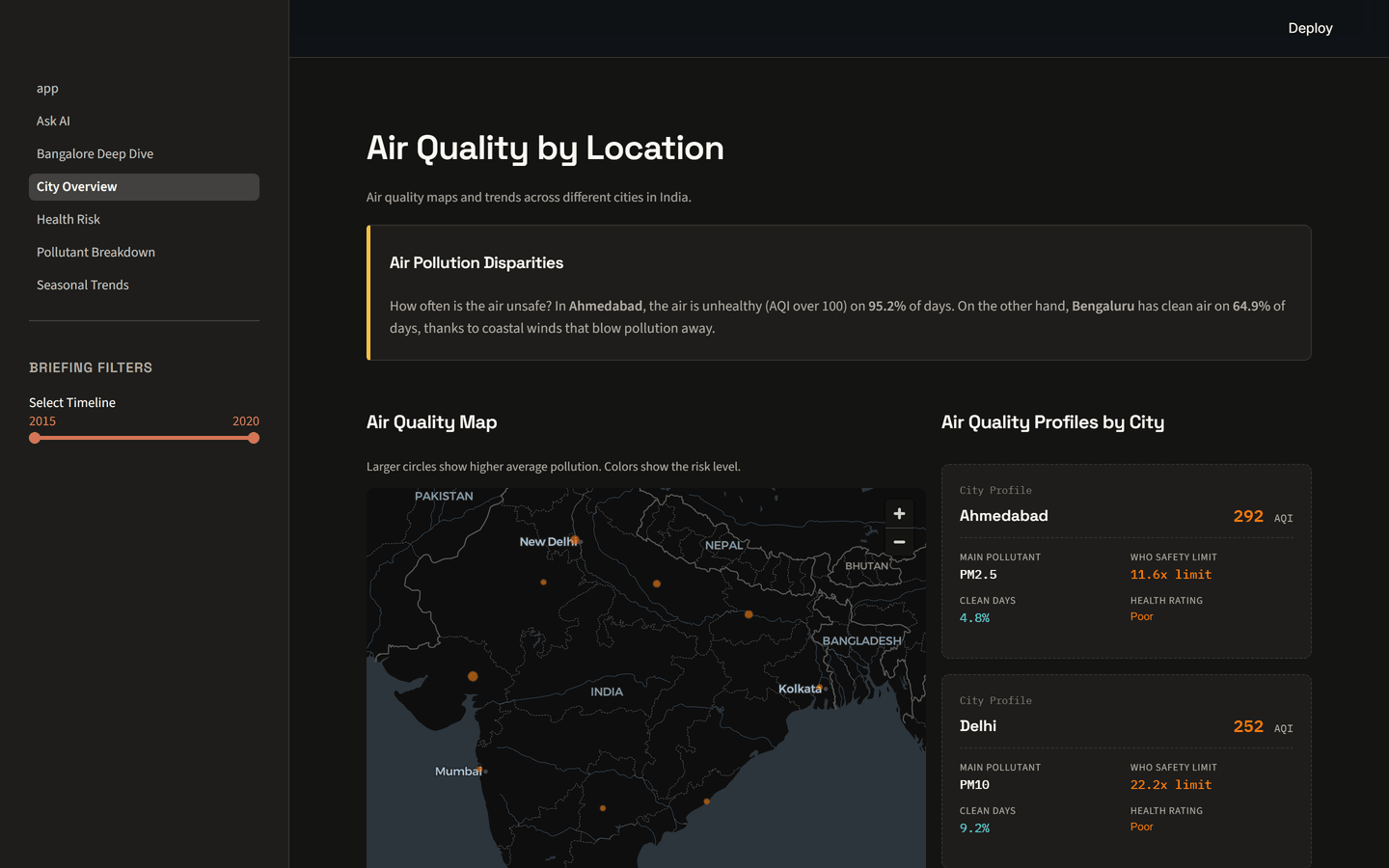
Air quality by location. A map of India where bigger, redder dots mean dirtier air. Click any city and you get its profile — its worst pollutant, its AQI, and the share of days that were actually clean. Ahmedabad is unhealthy on 95% of days; Bengaluru manages clean air on about 65%.
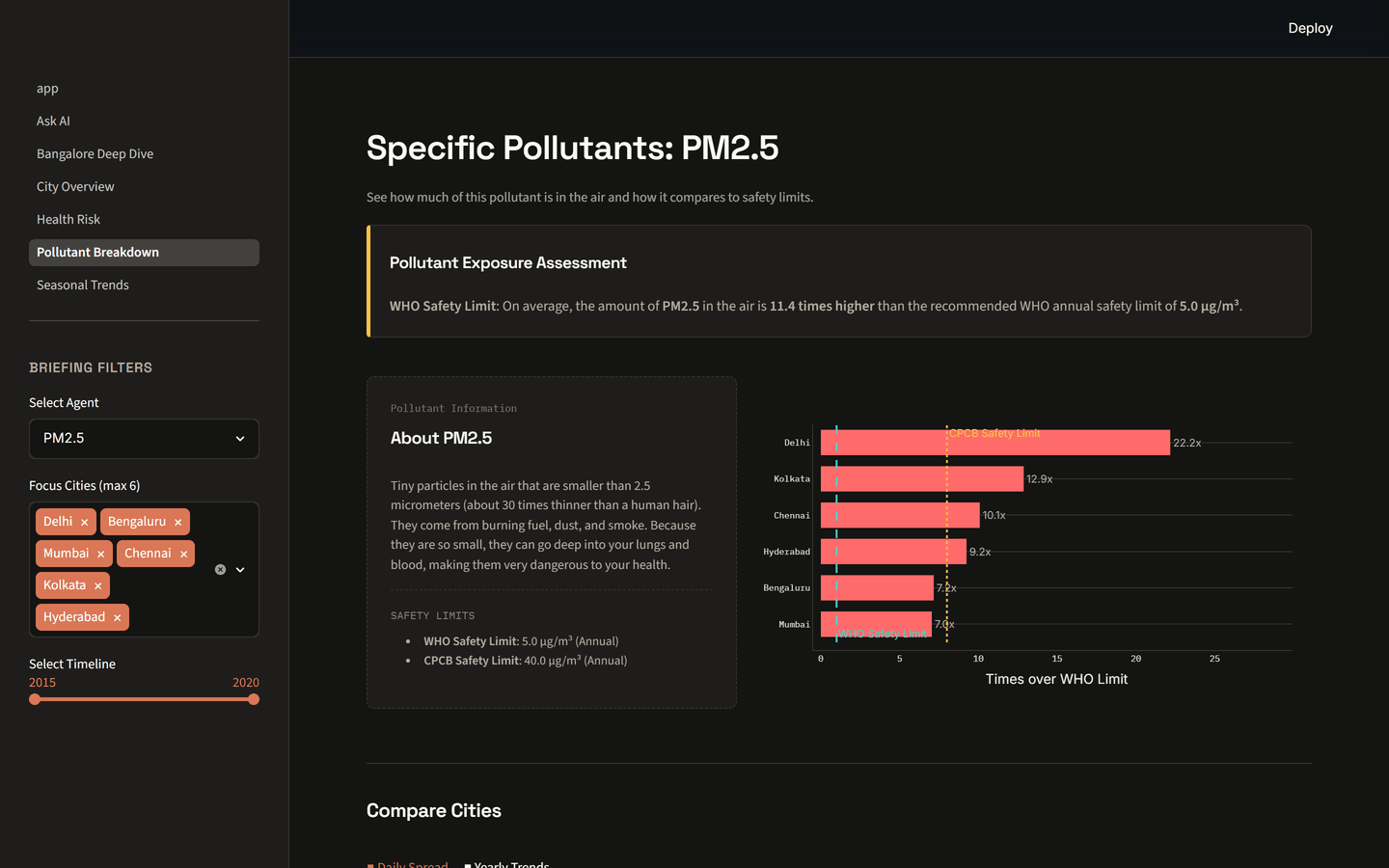
Down to the pollutant. You can pick a single pollutant and see exactly how far over the safety line each city lives. Take PM2.5 — tiny particles about 30 times thinner than a human hair that slip deep into your lungs and bloodstream. In Delhi, the average PM2.5 level runs about 22 times the World Health Organization's recommended limit.
There are more pages I will not screenshot here — seasonal patterns, a health-risk view, and a street-level "deep dive" into Bangalore across its 10 monitoring stations — but the shape is the same throughout: a plain-English insight at the top, then the chart that backs it up.
A short detour: the data lied, a little
Before any of this could be trusted, I had to deal with an awkward truth — some of the official numbers were simply wrong.
One set of monitoring stations reported an AQI of 727. The index physically maxes out at 500. That number cannot exist.
It was not only the impossible value. In places the published AQI did not even match the pollutant readings printed right next to it. So rather than display numbers I could not stand behind, I rebuilt the AQI myself — recomputing it from the underlying pollutant levels using the official CPCB formula, so every score is internally consistent. I also added a cleaning step that flags suspicious one-day spikes instead of deleting them, so genuine events like Diwali or crop-burning season survive in the record. The original values are kept alongside the new ones for comparison.
It is unglamorous work, but it is the difference between a chart and a chart you can actually believe.
The interesting part: an AI that reads the data
Ask a typical chatbot "which Indian city has the worst air?" and it will answer with great confidence and possibly invent the whole thing. I specifically did not want that. So the assistant here is built inside-out.
Instead of hoping the AI remembers facts about Indian air quality, I gave it tools — 11 small, well-defined functions that each do one job against the real data: rank cities by pollution, compare two cities, pull a city's recent trend, check a pollutant against the WHO limit, and so on. The AI's only job is to pick the right tool and read back the result.
The plumbing that makes this possible is MCP (the Model Context Protocol), a recent open standard for letting AI assistants call real tools in a consistent way. You can think of it as handing the model a calculator and a database lookup, rather than asking it to recite from memory.
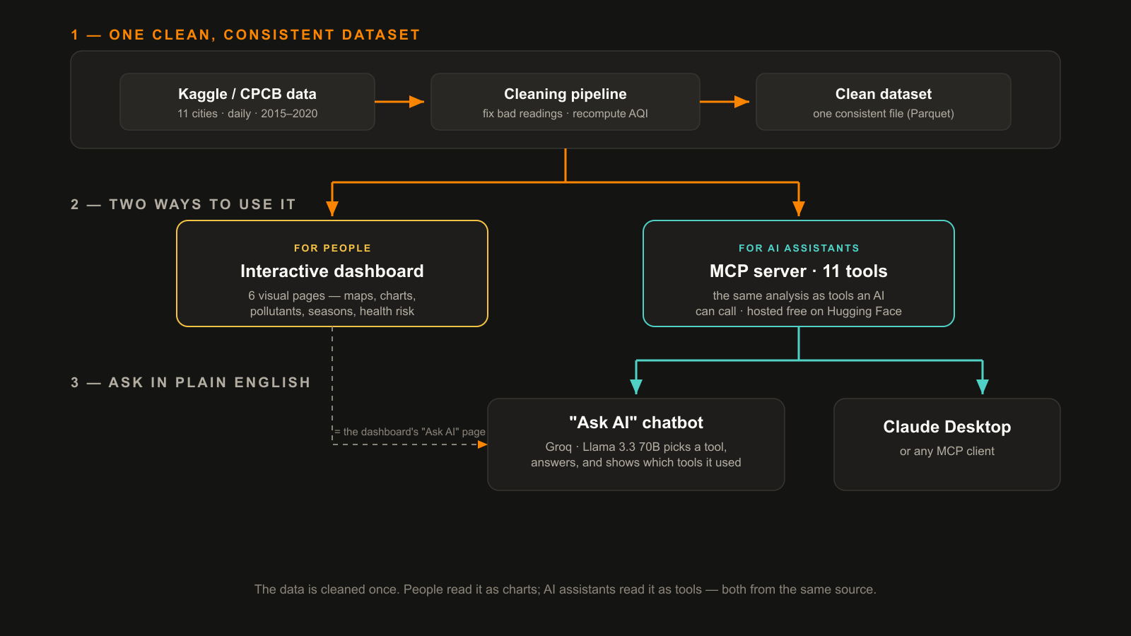
So when you type a question into the Ask AI page, a language model — Llama 3.3 (70 billion parameters), running on Groq — works out which tool to call, calls it against the cleaned data, and answers from what comes back. It never makes up numbers, it remembers the conversation so you can ask follow-ups like "and the cleanest?", and — importantly — it shows you which tools it used under each answer, so nothing is a black box.
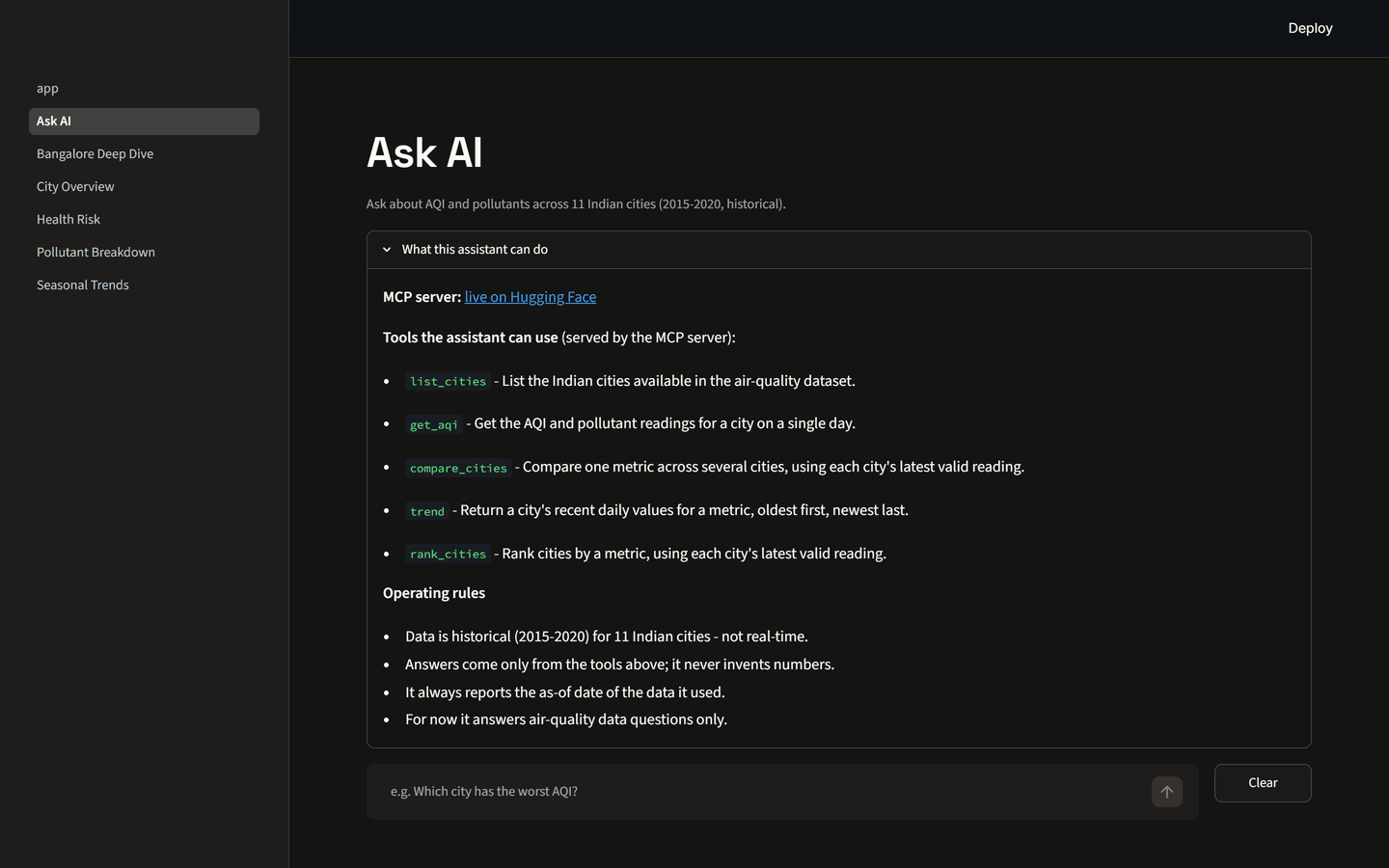
That tool server is public, not locked inside the website. I deployed it on Hugging Face, which means any program that speaks MCP — including Anthropic's Claude Desktop — can connect to it and answer air-quality questions the same way.
How it is built (the short version)
- Data & cleaning — Python and pandas; a small pipeline that recomputes the AQI and flags bad readings, saved as compact Parquet files.
- Dashboard — Streamlit, with Plotly charts and a custom dark "intelligence-briefing" theme.
- AI layer — an MCP server (Python) exposing the 11 tools, an agent built with LangGraph that decides which tool to call, and Groq's Llama 3.3 70B doing the reasoning.
- Hosting — the dashboard on Streamlit Community Cloud, the tool server on Hugging Face Spaces. Both free.
- Tested — an automated test suite covering the AQI maths, the cleaning rules, and all 11 tools, so a change cannot quietly break the numbers.
One honest caveat about free hosting: the tool server goes to sleep when nobody has used it for a while, so the first question after a quiet spell takes a few seconds to wake it up. Cheap to run, occasionally slow — a fair trade for a side project.
What is next
The data currently stops in mid-2020. The plan is to pull fresh readings from OpenAQ and have the whole thing refresh itself weekly, running them through the same cleaning and the same AQI formula — so "which city is worst right now?" finally means now, and not five years ago.
If you would like to explore it: the live dashboard, the AI server on Hugging Face, and the code on GitHub.
Bhuvan Desai
Applied AI & Data Science @ IIT Jodhpur · SIH 2025 National Finalist
Second-year B.S. Applied AI & Data Science student at IIT Jodhpur, focused on AI/ML, data science, and backend development. I build real projects end to end — from fine-tuned language models and agentic AI systems to production backends. Currently looking for an AI/ML or Data Science internship in Bengaluru.